Two screens can show the same image differently even when both work correctly. Their panels, factory settings, brightness, color capabilities, and surrounding light can differ. A phone image looking warmer than a desktop image is therefore a starting observation, not an immediate diagnosis of a broken monitor.
First decide what consistency means for your task. Comfortable office work, casual photo viewing, and preparing a color-critical print have different requirements. This guide builds a sensible baseline; it does not replace measured calibration and a managed workflow when accurate professional output is essential.
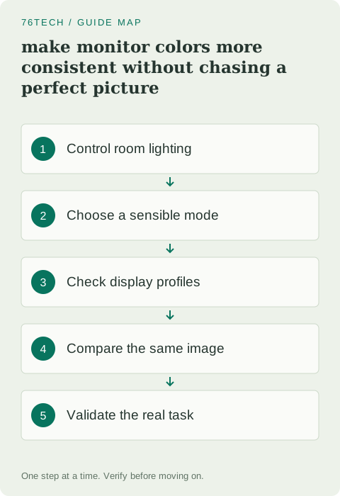
1. Control the viewing conditions
Use the monitor in its normal location and allow it to settle according to the manufacturer's guidance. Reduce obvious glare and avoid comparing screens under sharply different lighting. A bright window behind one monitor and a dark wall behind another can affect how you perceive their brightness and contrast.
Open a familiar neutral document and a photograph you know well. Keep the same content and application for each comparison. Do not judge color from two different websites that may be displaying differently processed copies of a picture. A useful test removes content differences before investigating display differences.
2. Review the monitor's picture mode
Use the monitor's on-screen controls to inspect its current mode. Gaming, vivid, cinema, and other presets may deliberately alter saturation, contrast, or processing. Read the manual for a standard or color-oriented mode suited to your task rather than choosing whichever preset looks most dramatic.
Record the original settings before making a comparison. Avoid stacking several adjustments at once. If switching from an exaggerated preset to a standard mode makes skin tones more natural, that is already a useful result. Do not then change every channel individually merely because more controls are available.
3. Set brightness for the workspace
Adjust brightness so ordinary text and backgrounds are comfortable at your usual viewing distance. An excessively bright monitor can make every photograph appear more luminous than its print, while a dim screen may hide details you would otherwise see. The appropriate level depends on the environment and the output task.
Compare the two screens with a white document rather than a colorful demo video. You are trying to reduce a major perceptual difference first. Matching a menu percentage does not match actual luminance across different models, so use that percentage only as a device-specific reference, not a cross-monitor measurement.
4. Check color-management settings
Inspect the operating system's display profile configuration and identify which profile is associated with the actual monitor. Microsoft's display color-management guidance provides a supported starting point for Windows controls. Use the monitor manufacturer's profile or a properly measured one when relevant to the workflow.
Do not assign a random profile downloaded for a similar-looking screen. A profile describes a device or color behavior; it is not a general enhancement filter. Keep a record of the previous association so you can reverse a comparison that makes the result worse.
5. Distinguish HDR and ordinary desktop content
Check whether HDR is enabled and whether your content and application are intended for that path. The appearance of ordinary desktop content can differ between SDR and HDR configurations. Monitor support, operating-system behavior, and application support all matter.
Use the manufacturer's and operating system's current instructions rather than treating HDR as an automatic quality upgrade for every task. Compare the same content in a deliberate configuration and note what changes. A setting that benefits one kind of video may not be your preferred baseline for document work or SDR photo editing.
6. Compare application behavior
Open the same local image in two applications whose color handling you understand. If it differs mainly between applications on the same screen, investigate the image profile and the applications' color-management support. Changing the monitor cannot fully explain a difference that follows the software.
For work destined for the web or print, follow the output workflow's expected color space and embedded-profile practices. Avoid repeatedly exporting an image with new saturation tweaks to compensate for one unverified screen. That can make the file itself wrong even when the monitor was the original source of the mismatch.
7. Know when measurement is worth using
If your work depends on reproducible color, a compatible measurement device and supported calibration software may be appropriate. Check the monitor's capabilities and the intended output process before buying equipment. Calibration, profiling, and soft proofing are related steps with different purposes.
Keep the baseline configuration stable while measuring. Follow the tool's instructions and validate against a meaningful reference or output. A software wizard operated by eye can help identify obvious issues, but it should not be described as equivalent to instrument-based measurement for critical work.
8. Verify with the actual task
Return to your normal documents, images, or video and check readability and consistency. If you use two monitors, move the same window between them and assess whether the remaining difference is acceptable for the task. Perfect visual identity between different panels may not be achievable or necessary.
Save the chosen mode, brightness, profile, and HDR state. If a driver update or factory reset changes the picture later, you will have a clear baseline. The useful outcome is a display you understand and can reproduce, with a realistic boundary between comfortable everyday viewing and work that requires a measured color-management process.