
An Android screen should make the next action easy to understand. Field Notes needs a title field, a Save action, and enough context to tell the user what is happening. This lesson builds that interface with Jetpack Compose. We will focus on structure and communication before adding permanent storage or a network request.
Compose describes the UI using composable functions. Those functions can run again as state changes, so think of them as describing what the screen should look like for the current input. A composable is not a convenient place to insert an unguarded database write or fetch operation. Keeping rendering predictable is the foundation for the state lesson that follows.
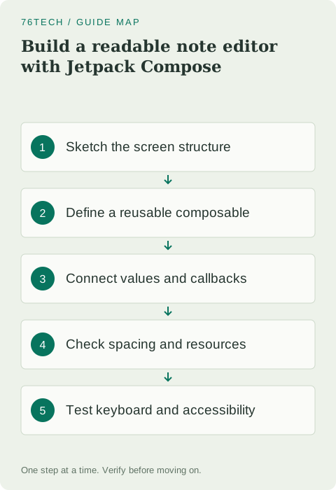
Sketch the screen before writing Kotlin
Draw a simple vertical layout: a heading, a labeled field, a short explanation when input is invalid, and a button. Decide which information the user needs first. The label should identify the field even after a person starts typing; a placeholder that disappears cannot carry all the meaning on its own.
Give the screen a clear successful outcome. In this lesson, the Save callback reports the title to a temporary host rather than persisting it. We will build the storage layer later. That limited contract lets you check that the interface sends the right event without pretending that a button already implements every part of saving.
Separate the screen from its state owner
Create a composable that accepts the displayed title and two callbacks. Its caller owns the values and decides what happens after an event. This makes the same editor useful with a preview, a temporary local state holder, or a ViewModel later. The screen's job stays understandable even as its surroundings change.
Before using the snippet, add strings named new_note, note_title, invalid_note_title, and save_note to your app's string resources with appropriate English values. Use the generated app package's R import. Compose layout imports come from androidx.compose.foundation.layout, Material controls from androidx.compose.material3, and stringResource from androidx.compose.ui.res.
@Composable
fun NoteEditor(
    title: String,
    onTitleChange: (String) -> Unit,
    onSave: () -> Unit,
    modifier: Modifier = Modifier
) {
    Column(
        modifier = modifier.padding(24.dp),
        verticalArrangement = Arrangement.spacedBy(16.dp)
    ) {
        Text(text = stringResource(R.string.new_note))
        OutlinedTextField(
            value = title,
            onValueChange = onTitleChange,
            label = { Text(stringResource(R.string.note_title)) },
            singleLine = true,
            modifier = Modifier.fillMaxWidth()
        )
        if (title.isNotEmpty() && !isValidTitle(title)) {
            Text(text = stringResource(R.string.invalid_note_title))
        }
        Button(onClick = onSave, enabled = isValidTitle(title)) {
            Text(text = stringResource(R.string.save_note))
        }
    }
}
The validation function comes from lesson two. The error text should explain the rule, for example that a title must contain text and fit within the chosen limit. Disabled buttons alone can leave a person guessing, so ensure the surrounding form communicates what input is required. A later submission flow can choose a more explicit error-display policy.
Give the editor a temporary interactive host
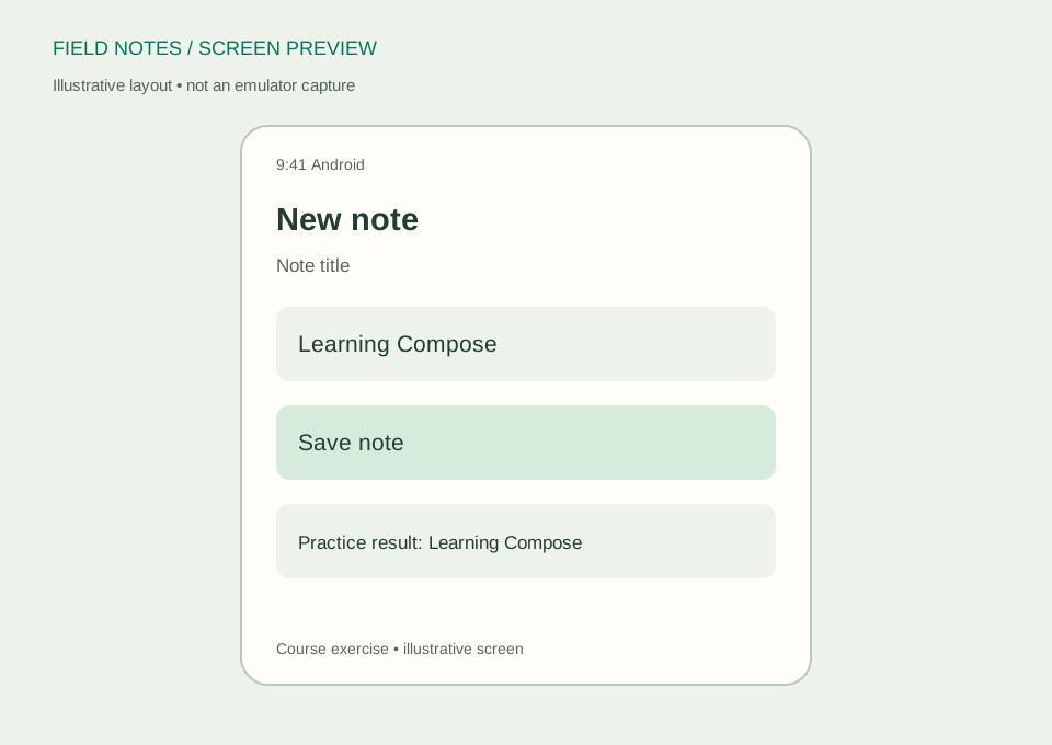
For now, wrap the editor in a small composable with local state. Add imports for rememberSaveable, mutableStateOf, and the delegated-state operators getValue and setValue. The wrapper demonstrates interaction, while NoteEditor itself remains independent of how values are stored.
@Composable
fun EditorPractice() {
    var title by rememberSaveable { mutableStateOf("") }
    var lastSaved by rememberSaveable { mutableStateOf("") }
    Column {
        NoteEditor(
            title = title,
            onTitleChange = { title = it },
            onSave = { lastSaved = title.trim() }
        )
        if (lastSaved.isNotEmpty()) {
            Text(text = "Practice result: $lastSaved")
        }
    }
}
Call this wrapper inside your generated theme. The practice-result line is temporary debugging feedback, not durable storage. Move its visible text to resources when making it part of a real interface. Type a valid title, tap Save, and compare the trimmed result with the input. Try whitespace only and text beyond the limit to check the form's rules.
Understand what modifier order changes
Modifiers adjust layout and behavior, and their order can change the result. Padding before a background does not describe the same visible area as padding after that background. Rather than memorizing a slogan, change one modifier in a disposable preview and observe which bounds move or receive color.
Accepting a modifier parameter lets a parent place and size the editor without rewriting it. Apply that parameter at the outer layout rather than discarding it. Keep internal spacing inside the screen and external positioning under the parent's control. This convention helps when you later place the editor beneath an app bar or inside a larger adaptive layout.
Use the template theme and real resources
Keep the generated Material theme around your content so standard controls use consistent colors and typography. Avoid hardcoding a separate visual system into every function. A theme is a useful place to make deliberate app-wide choices after the basic screen works.
Visible strings belong in resources when they become product text. Resource-based text supports localization and keeps labels consistent. Do not build sentences by joining several translated fragments whose order may differ in another language. Images also need a deliberate accessibility decision: meaningful content should have an appropriate description, while decorative content should not add unnecessary announcements.
Check the keyboard and system insets
Run the editor on a small device and open the keyboard. Confirm that the field and the action remain reachable. A layout that fits with the keyboard closed may be unusable during the very action it was built for. Make the content scrollable if needed and handle the app's scaffold padding and system insets according to your template.
Avoid fixing that problem with a single large hardcoded spacer. Test portrait, landscape, and larger system text instead. If the app uses a Scaffold, pass its content padding to the layout and review how keyboard insets are handled. These checks concern the whole host screen, not just the editor function shown above.
Complete a usability checkpoint
Use TalkBack or another supported accessibility inspection method to navigate the field and button. Confirm that their labels make sense without sight of the layout. Try increased font size and ensure text does not overlap or disappear. Standard controls help, but your labels, ordering, and surrounding layout still determine whether the screen is understandable.
Your exercise is to add a short helper message describing what Field Notes stores, then verify that the message remains readable while typing. Use the Compose basics codelab and Compose accessibility documentation for further practice. Next, we will decide which state belongs to this temporary wrapper and which should move into a longer-lived owner.